Learning Objective
Evaluate the effectiveness of different displays in representing the findings of a statistical investigation or probability activity undertaken by others

Provocation- Played digital clip of a NZ school that visited Australia. What sort of things would they need to know to plan a trip? Class brainstorm.
Create- We created a plan and researched the cost. This involved researching costs in New Zealand dollars. We had to find the cost of air fares and decide what we wanted to travel e.g. business class, economy. We had to find accomodation for 4 nights and estimate travel costs e.g. concession card for tram, train or bus. Then we had to find events or venues we wanted to visit and get the cost for these. Finally we had to calculate the whole cost.
Then we got into groups or 4-5 and compared costs. We had to transfer these findings on to a bar graph and analyse the information presented writing a couple of sentences about the information. Who planned the cheapest trip? Who planned the most expensive and how?
Share/ Evaluate- Next we used practiced making bar graphs with our information. Then using Google sheets tried presnting this data in different ways. We experimented with the different graph options and decided on the best option to use and present to parents on our open evening. We also shared our results to our math group.
Our presentations


 Our planning
Our planning


Analysis of Data
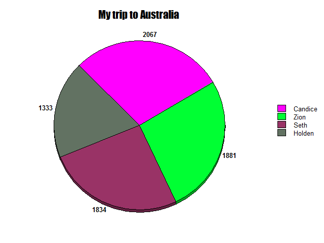
Candice had the most expensive trip
because she picked a more expensive motel and her flights were more expensive.
Holden’s was the cheapest cost
because his hotel was cheap, his flights were cheaper and he had cheap food.
There is a $600 difference between
Candice and Holden’s price. Zion’s was around $200 dollars less than Candice’s
and Seith’s was over two hundred dollars cheaper than Candice. Holden’s was
$500 cheaper than Seith’s total cost.
The graph we like best is the bar
graph because things are a lot clearer. You can also see the difference clearer
than with the pie graph and the size difference is not as noticeable.


My Analysis
The most expensive trip was Sharn’s at $9559. The less expensive was Holly’s at $1456. The difference is $8103.
This is because Sharn went in business class and his accomodation was more expensive.
We liked the pie graph because you notice a big difference in the size difference between the the least and the most.
From here I wonder what it would cost to go to America for a holiday.

`
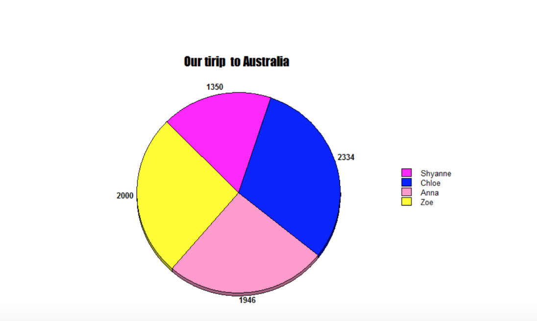
Our Analysis
The most expensive trip was Chloe’s at $2334 the least expensive trip was Shyanne’s at $1350. The difference between the most expensive and less expensive was $984.
I think this was because of movie world being so expensive (where Chloe wanted to go) and the coast of her accommodation which was really expensive.
The graph we liked the best is the Bar Graph because the bar graph is bright and cool. It is also easy to see that difference in prices.
We would like to learn the different costs of transport like, is it cheaper to go by boat to Australia?
What did you like best about our math inquiry? It was really interesting and it is not cheap for a holiday.


Our Analysis
The most expensive trip was lukhan’s $3058. The least expensive trip was Jealen $2000. The difference between the most expensive and less expensive was $1058. We think this was because the cost of flights and accommodation was the big difference.
The graph we like the best is the Bar Graph because it is easier to read than the pie graph.
We would like to learn about the cost of travelling in NZ because there are many places to visit.
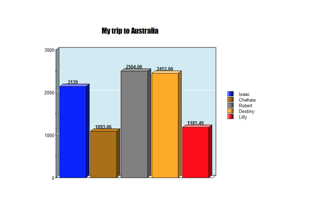
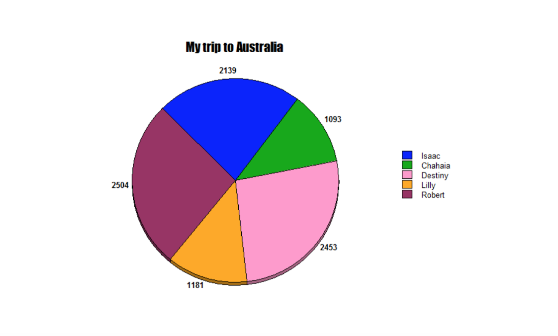
Our Analysis
The most expensive trip was Robert at $2504. The least expensive trip was Chahaia at $1093.The difference between the most expensive and less expensive was $1411. We think this was because Roberts accommodation. It was expensive.
The graph we liked the best is the Pie Graph because we understood it better.
We would like to learn about travelling to America.


Our Analysis
The most expensive trip was candice The least expensive trip was holden The difference between the most expensive and less expensive was $734 We think this was because we used holden and candice’s and took away candice’s with holden’s the activities
The graph we like the best is the Bar Graph because i liked the bar graph i can see it better. It is sort of 3D.
What did you like best about our math inquiry?
Making the graphs was really fun and easy.
Where to next….
We wonder if we collected all the data together from each group what would it look like.
The most expensive trip was Robert at $2504. The least expensive trip was Chahaia at $1093.The difference between the most expensive and less expensive was $1411. We think this was because Roberts accommodation. It was expensive.
The graph we liked the best is the Pie Graph because we understood it better and it looked like a pizza.
We would like to learn about travelling to America.


Group Statistics Inquiry Presentation - Jaelah
What went well..
Finding my information.
What didn’t go so well…
Staying in my budget.
How could you make things better next time?
Explaining my work better during the presentation.
What did you enjoy about this mathematical inquiry?
I enjoyed making the graph.
Name one thing you learnt
That Aussie is expensive and learning to collect data.
Group Statistics Inquiry Presentation - Zoe
What went well..
Drawing my bar graphs on paper and sharing with my class mates to the class
What didn’t go so well…
Using the iPad because I was not in school when Mr Cron showed us what to do.
How could you make things better next time?
To get better at explaining my work in class.
What did you enjoy about this mathematical inquiry?
I loved all of it because it was pure fun.
Name one thing you learnt
How to put graphs together.
Group Statistics Inquiry Presentation- Anna
What went well..
Working with other children because if I was’t sure someone would know.
What didn’t go so well…
Working out which one was more expensive and which one was least expensive.
How could you make things better next time?
Share more information and read it clearly to others.
What did you enjoy about this mathematical inquiry?
It being different than what we have done in the past.
Name one thing you learnt
Doing pie graphs and having fun.
Group Statistics Inquiry Presentation-Holly
What went well..
Making the bar and pie graphs.
What didn’t go so well…
Arguing in our group
How could you make things better next time?
I don’t know.
What did you enjoy about this mathematical inquiry?
Making the graph
Name one thing you learnt
Making a graph and finding out stuff
Group Statistics Inquiry Presentation-Keiran
What went well..
I liked doing this maths it was fun.
What didn’t go so well…
The rest of my team didn’t do that much.
How could you make things better next time?
Choose different people to work with
What did you enjoy about this mathematical inquiry?
Doing the pie graph and sometimes researching information.
Name one thing you learnt
How to make graphs and all the things you need to plan for when going to oz.
Group Statistics Inquiry Presentation- Bryson
What went well..
The pie graph and bar graph because they are easy to read because of the size.
What didn’t go so well…
We could have read more of the work we did but we felt nervous.
How could you make things better next time?
Work better with others and discuss things better.
What did you enjoy about this mathematical inquiry?
It was fun because we got to work out all the different costs.
Name one thing you learnt
All the different costs,
Group Statistics Inquiry Presentation-Chloe
What went well..
Working with others.
What didn’t go so well…
It was distracting at first.
How could you make things better next time?
I needed to speak up.
What did you enjoy about this mathematical inquiry?
The different maths things that I had not done before.
Name one thing you learnt
Doing the different graphs and having lots and lots of fun.
Group Statistics Inquiry Presentation- Candice
What went well..
Working with others
What didn’t go so well…
Working out the difference between all the costs.
How could you make things better next time?
Showing more information like all the different costs of accomodation.
What did you enjoy about this mathematical inquiry?
All the different math things that were involved.
Name one thing you learnt
Doing pie graphs and having lots of fun.
Group Statistics Inquiry Presentation-Meliki
What went well..
Adding the numbers up.
What didn’t go so well…
Nothing
How could you make things better next time?
Not sure
What did you enjoy about this mathematical inquiry?
Picking different kinds of activities to do.
Name one thing you learnt
How much it costs to go to Australia and come back.
Group Statistics Inquiry Presentation- Shyanne
What went well..
Anna got the numbers right.
What didn’t go so well…
I couldn’t finish all the sentences.
How could you make things better next time?
Talk up and share my ideas.
What did you enjoy about this mathematical inquiry?
It was fun and I loved seeing the graphs with all the information.
Name one thing you learnt
I learnt that a pie graph is cool and learnt about some higher numbers.
Group Statistics Inquiry Presentation-Robert
What went well..
Working with others.
What didn’t go so well…
I got distracted at first.
How could you make things better next time?
By not being distracted and to work well with everyone.
What did you enjoy about this mathematical inquiry?
Working with other people I have never worked with.
Name one thing you learnt
To read a pie graph and learn how to use one.
Group Statistics Inquiry Presentation-Seth
What went well..
Working as a group.
What didn’t go so well…
It took us a while to understand and solve it.
How could you make things better next time?
Think faster to get more ideas.
What did you enjoy about this mathematical inquiry?
Comparing the bar graph and pie graph.
Name one thing you learnt
Doing an analyse of the graphs and results.
Group Statistics Inquiry Presentation-Sharn
What went well..
Working together.
What didn’t go so well…
We weren’t completely focused.
How could you make things better next time?
Be more focused and try a few more things and speak up when I presented.
What did you enjoy about this mathematical inquiry?
I learnt about collecting data and to talk about this.
Name one thing you learnt
Learning to read the pie and bar graph.
Group Statistics Inquiry Presentation-Holden
What went well..
Searching on the computer for food prices.
What didn’t go so well…
My own behaviour.
How could you make things better next time?
Better behaviour.
Listening to Mr Cron and Lynley.
What did you enjoy about this mathematical inquiry?
Seeing the graphs and learning who had the least and most cost.
Name one thing you learnt
The price of the cost to Australia.
Group Statistics Inquiry Presentation- Violet
What went well..
My group worked as a team in the end.
What didn’t go so well…
The noise was pretty loud.
How could you make things better next time?
Taking turns during the presentation. Not all of us had a go.
What did you enjoy about this mathematical inquiry?
Learning about graphs and experimenting with the iPad.
Name one thing you learnt
That pie graphs and bar graph look different but show the same information.
Group Statistics Inquiry Presentation- Jaelen
What went well..
I tried my best.
What didn’t go so well…
Adding it up and entering the data.
How could you make things better next time?
Work faster and be more focused on what we are trying to do.
What did you enjoy about this mathematical inquiry?
Seeing the graphs after entering the data.
Name one thing you learnt
How expensive it is to travel and stay in Australia.
Group Statistics Inquiry Presentation- Isaac
What went well..
Reading the graphs.
What didn’t go so well…
Getting annoyed at other people.
How could you make things better next time?
Researhing other stuff.
What did you enjoy about this mathematical inquiry?
Making the graphs.
Name one thing you learnt
Learning to read and use a pie graph.
Group Statistics Inquiry Presentation-Destiny
What went well..
Getting the job done.
What didn’t go so well…
We were off task at times
How could you make things better next time?
I needed to help present the data as well.
What did you enjoy about this mathematical inquiry?
Playing with the data and seeing it turn into a graph.
Name one thing you learnt
The difference between a number of graphs.
Group Statistics Inquiry Presentation-Lilly
What went well..
Getting the job done with Destiny.
What didn’t go so well…
We were off task at times.
How could you make things better next time?
I didn’t present our data which I should have.
What did you enjoy about this mathematical inquiry?
Playing with the data and seeing it turn into a graph.
Name one thing you learnt
The difference between a number of graphs.


No comments:
Post a Comment